The Learning Process
From the flatground up
What layouts and obstacles would help facilitate the process of learning how to skateboard?
Skateboarding is an interaction with the environment. The environment in which a person is skateboarding plays a huge role in how difficult or easy it is to skateboard. For instance, learning to skate flatground on a 6 foot wide brushed concrete sidewalk that has cracks every 4 feet is harder than learning to skate flatground in a wide open plaza laid with smooth granite pavers. This of course is obvious. What’s not obvious, but is true, is that learning to skate flatground on a 6 foot wide brushed concrete sidewalk that has cracks every 4 feet could be easier than learning how to skate flatground in most skate parks. Unless you are an adult who doesn’t have a 9 to 5 and can hit the skateparks early on a weekday morning before it’s filled with experienced skaters whizzing around competing for space and obstacle use.
Usually though it’s a child or teenager who is learning how to skate. Besides a few months in the summer, their schedules don’t allow them to frequent skate parks during the off times. The situation is so bad that kids need skate lessons. The skate instructor might kind of teach them how to skate but mostly they have to show them where to stand and where to skate so they don’t get mowed over by other skateboarders. The beginner skater has to put so much focus on where the other skaters are around them in these skate parks that it can be hard for them to focus on learning how to skate. This is why a rough textured, skinny sidewalk where people are at least just intermittently walking by can be an easier place to learn how to skate flat ground than most skateparks
The ironic part is that the skate park was probably pitched to the community as a place where kids could learn how to skate.
Many of the design problems kids have to deal with at skate parks are similar to the ones they experience with playground design.
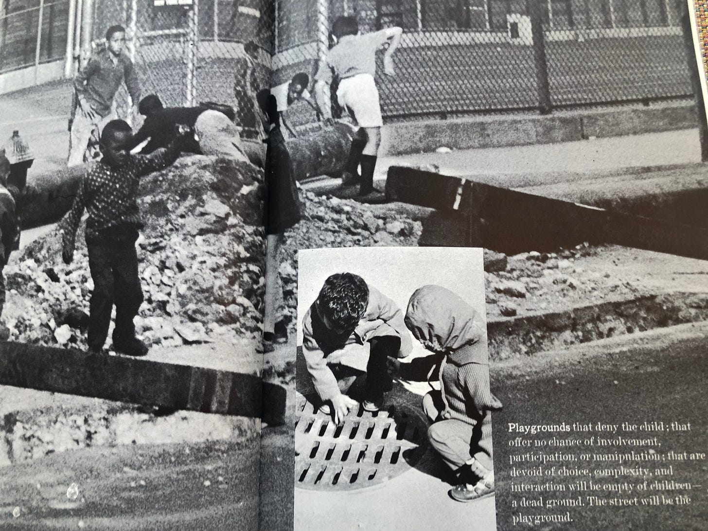
The following is an excerpt from a book called Design for Play by Richard Dattner. It was published in 1969. The book is about progressive playground design. A good number of the problems Dattner cites with the common playground design of that time are similar to problems I bring up with modern skateparks. I found that many of the perspectives and solutions offered in the book could also help to improve skatepark design. In this excerpt we learn how design elements can positively and negatively influence (or affect) a child’s learning process. In parentheses and in bold are my additions to emphasize the relevance of this excerpt to our skatepark conundrum.
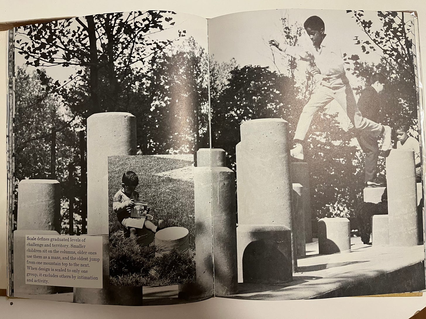
Learning we have seen, is a combination of repeating the performance of something we already know in order to perfect it (assimilation) and mastering new things requiring new combinations of skills and ability (accommodation). An environment (skatepark) that provides only the familiar, challenges that have already been overcome countless times, will never call forth any new learning. Similarly, a place (skatepark) that is too challenging creates too large a gap between what children (skaters) feel confident of through past experience and the new task, thereby overwhelming rather than encouraging them.
A playground (skatepark) therefore should present a series of challenges, ranging from simple things that toddlers (beginner skaters) can master to ones that challenge older and more experienced children (skaters). There should be continuity, so that each child (skater) always has the dual experience of having mastered some aspects of his environment while knowing there are other aspects that he may still aspire to master. As in adult life, the individual who feels he has accomplished everything and the one who is so overwhelmed that he is unable to accomplish anything have both reached a point where further growth and development are impossible.
Another advantage of play facilities (skateparks) incorporating a broad spectrum of activities is that children (skaters) of different ages may coexist peacefully, learning from and teaching each other but sufficiently separated by their skills and abilities to keep the young children (beginners) safely out of the way of the older ones (advanced skaters).
Coincidentally, many of the playgrounds Dattner and even the designer who inspired him and other progressive playground designers at the time, all designed playgrounds that are, were, or would have been amazing skate spots.
If we think of the learning process in the way it’s described in the above quoted paragraphs, I feel it provides a solid approach to motivate us to design, literally and figuratively, from the ground up.
Flat ground is the most rudimentary place from which to begin the process of learning how to skateboard. A child or person just starting out skating can put both of their feet on the board with relatively little risk and get a feel for how the trucks bend. Figure out if they are regular or goofy footed. Take a push and get an idea of how fast the wheels roll. Press down on the nose and tail to get used to that movement. Go through all the basic motions of skating flat ground. From pushing, to a flat ground ollie to turning and carving. None of these are too difficult to master in an environment that provides smooth ground and an adequate amount of open space.
From there rolling up and down small inclines becomes manageable. So does dropping in on a small quarterpipe. Ollieing up a curb and boardsliding a parking block are all within reach. And so on and so forth from there.
After a skater gets comfortable on flatground and comfortable on smaller obstacles they’re pretty much ready to move on to ledges and bigger quarterpipes.
With this progression we see that during every step of the beginner’s process of learning how to skateboard they were provided with obstacles that were a challenge but not so much of a challenge that they would feel overwhelmed. The gradual progression from flat ground, to curbs, parking blocks and small quarterpipes then moving on to ledges and bigger quarterpipes provides the continuity for a beginner skater to have the dual experience of having mastered some aspects of his environment while knowing there are other aspects that he may still aspire to master.
I briefly mentioned some obstacle ideas for a beginner section in the last article and in this one. Since this is the learning process article I’ll elaborate more on that now.
Recessed ride on curb grind: this obstacle would be a rectangle or square and would be recessed about 3.5 to 4 inches. This would allow for tailslides and grinds. It would resemble the tree planters often found in cities that street skaters use as recessed curb spots. The basic design could even be modified to aid the beginner. One way would be to have the recession gradually slant upwards until it’s flush with the curb. This way a skater could ride on to the grind but not have to hop out of the recession. Any skater that could roll could quite easily, with a little bit of aim, grind.
Parking block: A backside boardslide on a parking block can easily be attempted and learned after a person has gotten comfortable enough on a board to roll around and turn. The parking block should have the typical California red curb slant to make learning how to slappy easier. It should be no less than 12 feet long but longer is preferable. The long parking block is also a favored obstacle of older skaters. This creates another potential learning experience because the beginners would end up skating the curb with the older more experienced skaters. In a skate park that’s laid out in a way that is free of obstacle usage conflicts skaters tend to socialize, encourage and learn from each other while skating together.
A regular curb: the regular curb should be 6 to 7 inches high, at least 30 inches deep, 10 feet wide (but wider is better) and have two endpoints. It should also have a classic California red curb slant on the side and it definitely should be painted concrete. Preferably placed on one side of the perimeter of a space.
Manual pad: the manual pad would be the same height as the curb but it would be 8 feet deep and somewhere between 6 to 8 feet wide. This would then serve as a manual pad and an end to end curb.
A higher manual pad: This manny pad would be the same width and depth as the lower version. The height would be 14 inches.
A small quarter pipe: The quaterpipe should be no higher than 3 feet. Design features that could make the quarterpipe more accommodating to those just getting started skating would include a backing set in 25 to 30 inches from the deck. Preferably a wall that extends at least 6 feet above the deck. This would provide a safety for beginners. Visually it makes the quarterpipe more approachable as well. The radius of the quarterpipe should be chosen with the beginner in mind. The quarterpipe should be separated into its own section. It could be placed on the perimeter of the space and then have low walls surrounding it on the other three sides for separation. There would be a small entrance or two strategically placed. This way benches could be placed along the low separation walls for skaters or non skaters to sit on, socialize and watch friends skate the quarterpipe.
Bank to curb: The height of the bank to curb would match the height of the quarterpipe. The height of the curb would be the same as the height of the curbs in the skatepark. It could be placed next to the quarterpipe.
Stair set and drop: a set of 3 or 4 stairs. The drop would be part of the same structure as the steps so it would be the same height but the bulk of the structure would be stairs while the drop section wouldn’t be as wide. Somewhere around a 20:80 split depending on the total width of the stair/drop structure. The drop would extend out as far as the bottom step. This set up would create a mini ride on grind. Which would provide another stepping stone type of obstacle from the flatground ride on grind. On the other end of the stair set could be a small hubba or out ledge. A 3 foot wide slant could be placed on the end with the hubba as well. This way there’s still a wide section of stairs only, between the ride on grind and the slant/hubba. The drop/ stair combination would provide the series of challenge continuity that should be a high priority in designing a beginner section.
Metal plate: the metal plate would lay flush with the ground but could be propped up on one side and used as a launch.
Movable obstacles: a recycled plastic bench similar to the benches in southern California schoolyards. A flat bar, a garbage can and one low and one high construction cone. The dimensions of the flat bar and bench would be relative to the dimensions of the other obstacles in the park and the footprint of the skatepark in which they would be. The garbage can could be scaled down to a beginner/ child size as well. The movable obstacles would allow skaters to manipulate and be more interactive with their environment. The garbage can would provide something to launch over off of the propped up metal plate but it could also be ollied over off of flatground in any orientation. The flat bar and bench could be set off the end of the curb or set of stairs if the skatepark has a stair set. They could be turned perpendicular and used as an obstacle to do tricks over or they could be parallel and be slid or grinded. The bench could even be used as movable seating if no one is skating it. Since the layout of the park would strategically allow for open space the movable objects could be placed on the perimeter of the skatepark and be fully out of the way when not in use.
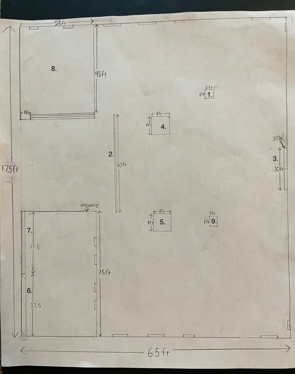
Below is a sample layout that includes all of the (non-movable) obstacles listed above. The numbers of the obstacles in the obstacle list above correspond to the numbers on the drawing. The small rectangles that line the edges are benches that are meant for sitting. They would have arm rests and/or be made out of a non skate friendly material to differentiate them from the skate obstacles.
The basic and spacious layout is intentional. It provides ample flatground space and sufficient approach space to all obstacles. In the next article I’ll get more into the intricacies of this seemingly simple layout.
The size of this layout may seem generous but the footprint is actually smaller than a soccer or football field. It is somewhat close to double the length of a basketball court but not much wider. In New York City it isn’t all that uncommon to see multiple basketball courts in one park/space.
Of course these aren’t the only obstacles that could be in this type of section but any beginner section should include a good portion of this list.
So far the obstacles and layouts I’ve talked about in these articles have been pretty basic. I realize that because of this it may seem like I have a disdain for any creative designs or fast paced layouts.
This is not the case. The reason why it sounds this way is because so far my focus has been on the basic fundamental obstacles and layouts that are needed for a skater to achieve a solid foundation of skateboarding abilities in an incremental and enjoyable manner. Achieving a well rounded basic foundation of skateboarding ability gives a skater the skills needed to enjoy the more creative and obscure obstacles and faster paced layouts.
If the fundamental obstacles and layouts are skipped and a designer jumps right into obscure obstacles and intricate layouts, only the skaters who have developed a solid foundation of skills from years of street skating, out of town skatepark skating or those who take an interest in skating and find they have a natural ability will have the potential to enjoy the “creative” clustered and/or “extreme” designs. Therefore forgoing the basic obstacles and layouts that allow skaters to gradually build up their skateboarding skills leads to a very exclusionary design.
The anchor to this design approach was developed from the perspective of a beginner skater. However, due to the way skateboarding works, the obstacles and layouts this point of view gives us would prove to be highly usable and enjoyable to skaters of all abilities because so much of skating “is a combination of repeating the performance of something we already know in order to perfect it (assimilation) and mastering new things requiring new combinations of skills and ability (accommodation).” This is true throughout the lifespan of pretty much every skater. That’s how just about everyone skates. The fundamentals are frequently revisited and refined.
So we see that a basic layout of strategically spaced obstacles and well thought out dimensions proves to be highly usable to all skaters. It would also provide an environment in which all skaters can learn and progress. As opposed to the creative, clustered and/or extreme parks that rarely or only partially provide the layouts and obstacles needed to brush up on these fundamentals. Which in turn makes them less usable and enjoyable for experienced skaters and hardly or not at all usable for beginners.
The popularity of skateboarding has increased steadily for decades now. In spite of the fact that the spaces we make for skateboarding are hostile to beginner skaters. Not only that but they rarely provide well proportioned obstacles in a properly spaced layout that allow experienced skaters to brush up on and perfect the basic fundamentals of skateboarding. Imagine the popularity increase if we designed spaces that instead accommodated the learning process of beginner skaters and the continual learning process of more experienced skaters as well.
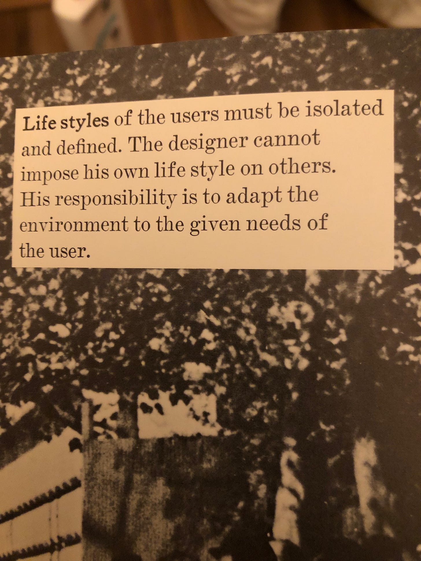
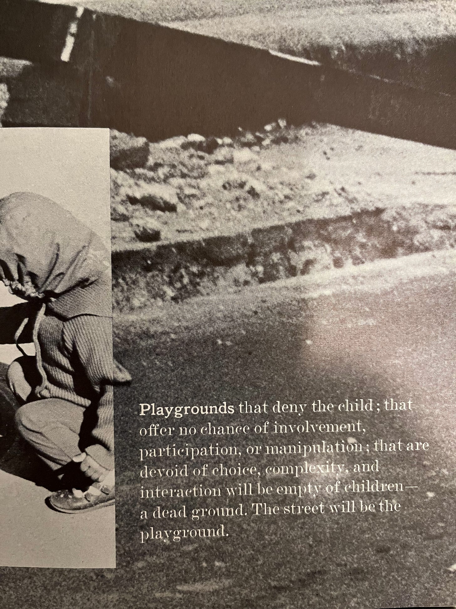
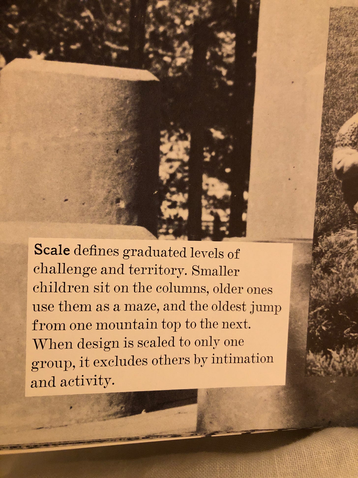
The pictures and quotes used in this article are from a book called Play and Interplay by M. Paul Friedberg with Mary Ellen Berkeley.
Here is a link to Design for Play by Richard Dattner.
The book that lead me to the two books above is titled The Invention of Public Space by Mariana Mogilevich, published in 2020. It covers the public space design movement that took place in the 60s and 70s in New York City and how those designs played out. Enabled by the John V. Lyndsy administration Dattener and Friedberg were able to test out these new design theories in the real world. Dattner in playgrounds and Friedberg in public housing projects. From a skateboarders perspective I find it compelling that a design movement that took place in the 60s and 70s (a decade or so before 1980s street skating would become advanced enough to utilize these spaces) would go on to be such a huge influence in the development of street skating. For this reason alone I think it’s worth examining the philosophies, perspectives and built results that designers like Dattner, Friedberg and others from this movement gave us to help improve the design of the spaces we make for skateboarding.
Awesome read!
This was a great piece.
I couldn’t agree more about many of our skateparks being too cluttered with creative or extreme obstacles in a way that deters or inhibits beginners.
And as you pointed out, even us more experienced skaters are quite happy with more beginner/chill type obstacles.
I’ve been skating for 20 years and recently, instead of going to my local park I’ve found a nice smooth underground carpark where I can skate at night and just play around doing flat ground tricks and it’s been great.
Point is, I would be stoked to skate a park that was designed like the one you shared in your piece.
Thanks :)